
6 week project
Design brief:
- As a team conduct primary research into Carleton university registration system
- Synthesize the results using research methods
- Create a prototype of the changed interface of the platform
- Synthesize the results using research methods
- Create a prototype of the changed interface of the platform
context
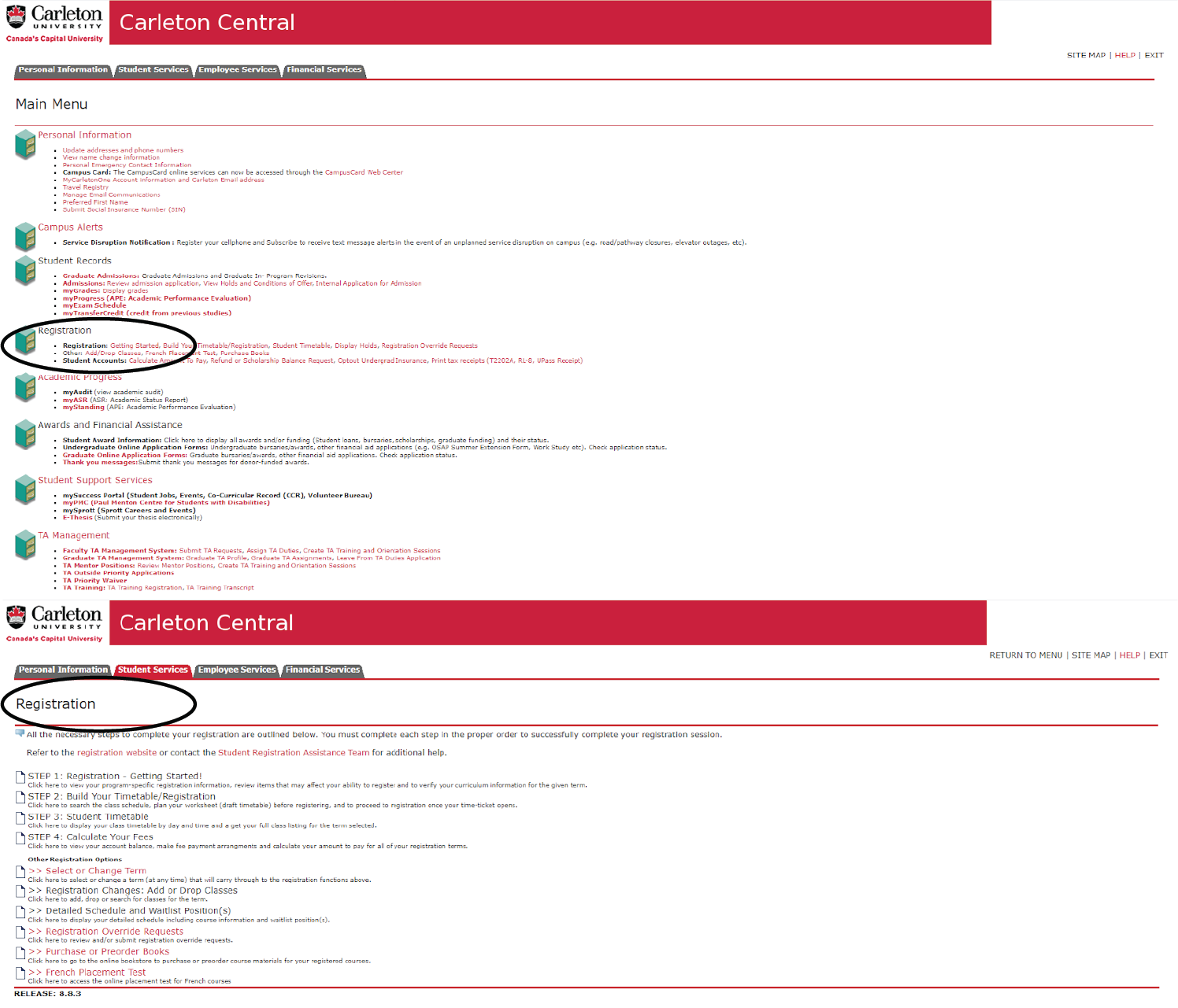
Currently Carleton Central website (the platform which is a school-wide online services website, and contains registration information along with other important for students links) looks very messy and disorganized
All of the information is shown in a text form with a lot of white space in-between
Users:
carleton University students
Other stakeholders:
- Registration staff
- Admissions staff
- Professors
- Admissions staff
- Professors
research
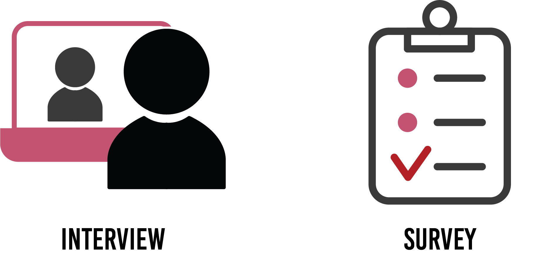
survey results


synthesis: affinity mapping

AFFINITY MAP COMPLETED AFTER REVIEWING AND SHARING COLLECTED DATA
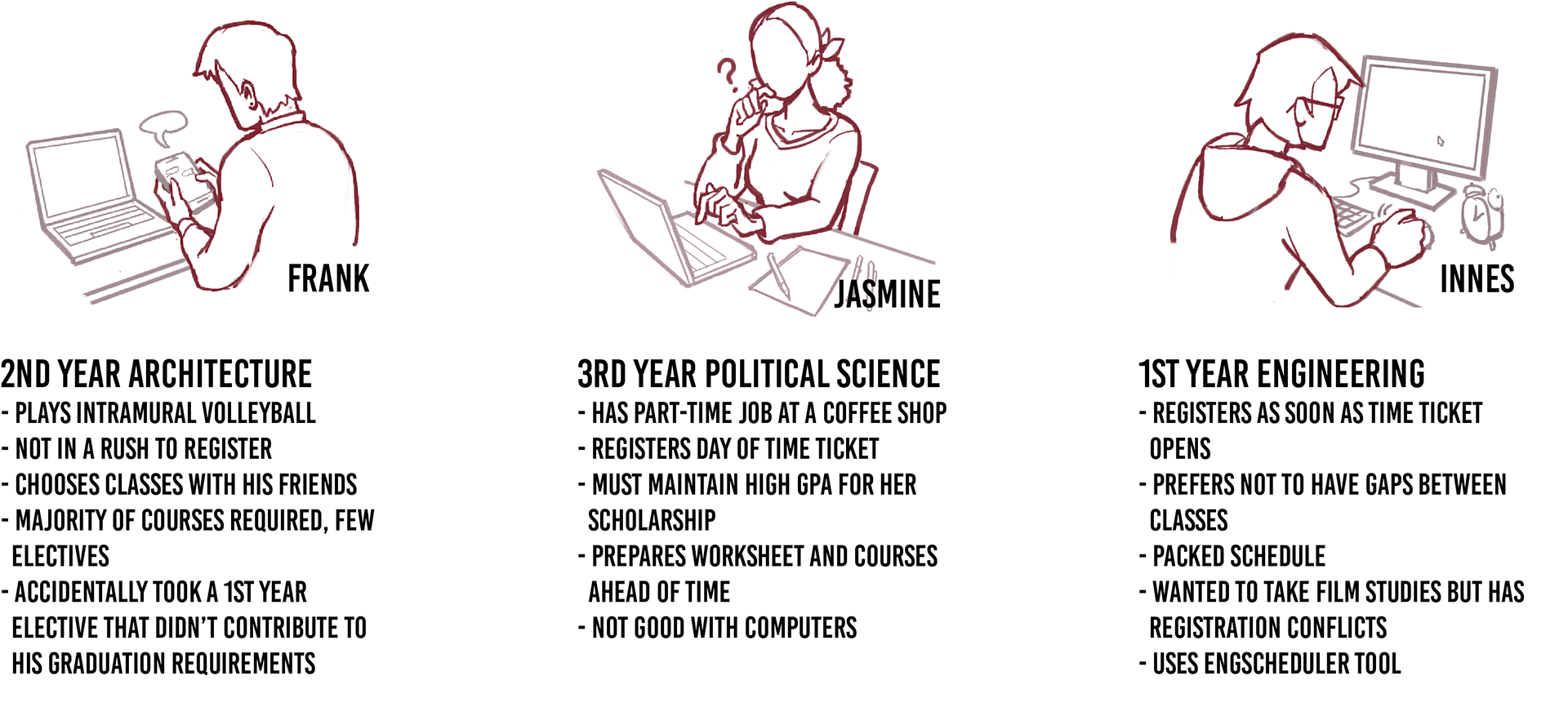
synthesis: PERSONAS
synthesis: what we learned

Registration is confusing, poor semantics
Requirements and expectations are not clear
No clear feedback of the process
Carleton Central alone is not providing all of the tools needed to register
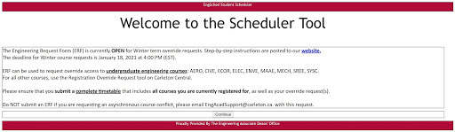
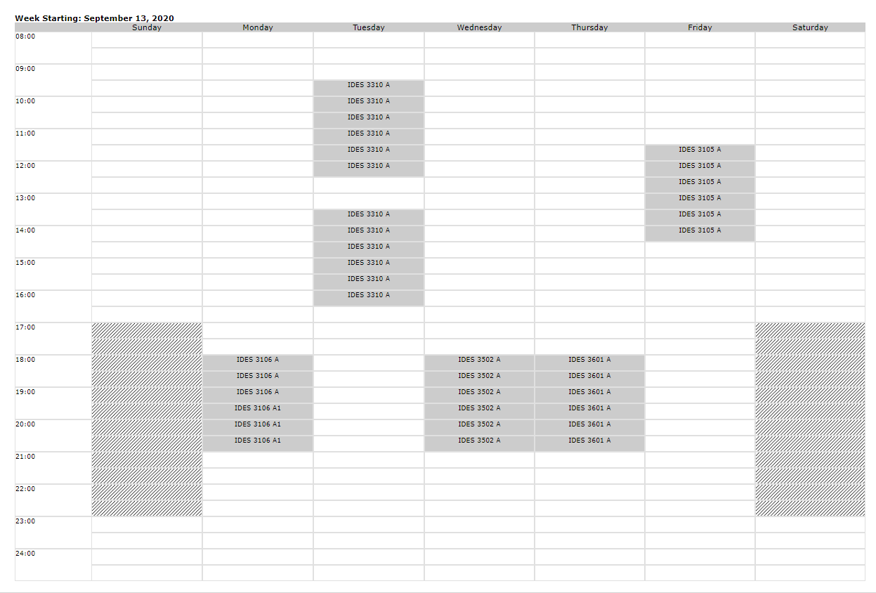
*on the left you can see an Engsheduler tool made by one of the engineering students. It allows for students to find the best fitting labs and courses for their timetable
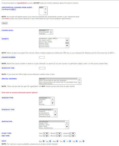
Carleton Central registration system lacks visuals to help with communication
Small system details can be improved
The website can be hard to navigate for people with disabilities
the big question:
how can we instill more confidence in the registration process?

prototype made in adobe xd and presented by one of the team members


